From Cluttered to Converting: Landing Page Optimization for One Day Doors & Closets
One Day Doors & Closets needed a better-performing promotional landing page — fast. As a Senior Designer, I partnered with their in-house marketing team to diagnose what was actually broken, then designed a modular, performance-driven page system that would convert better and make it easier for the team to launch new pages going forward.
Client
One Day Doors & Closets
Role
Senior Graphic Designer
Project
Design Systems, Landing Page Design
The Situation
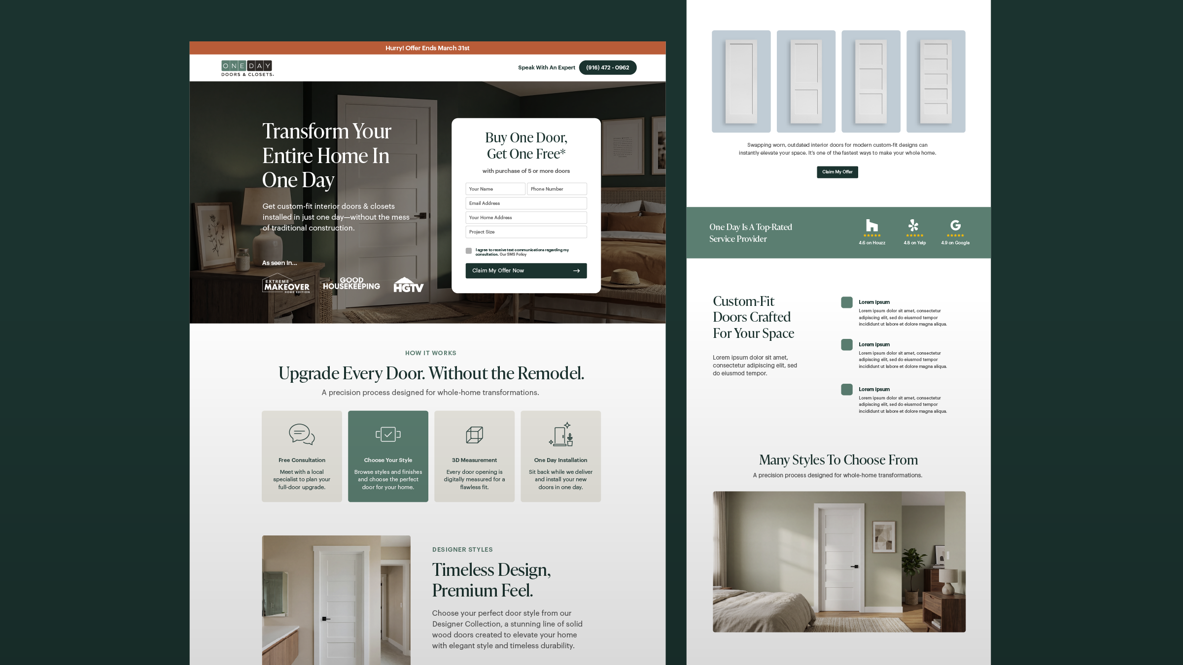
At 15,000 monthly visitors, the page had real potential, but conversion had stalled at 2.1%. Every percentage point represented hundreds of missed leads, so the gap mattered.
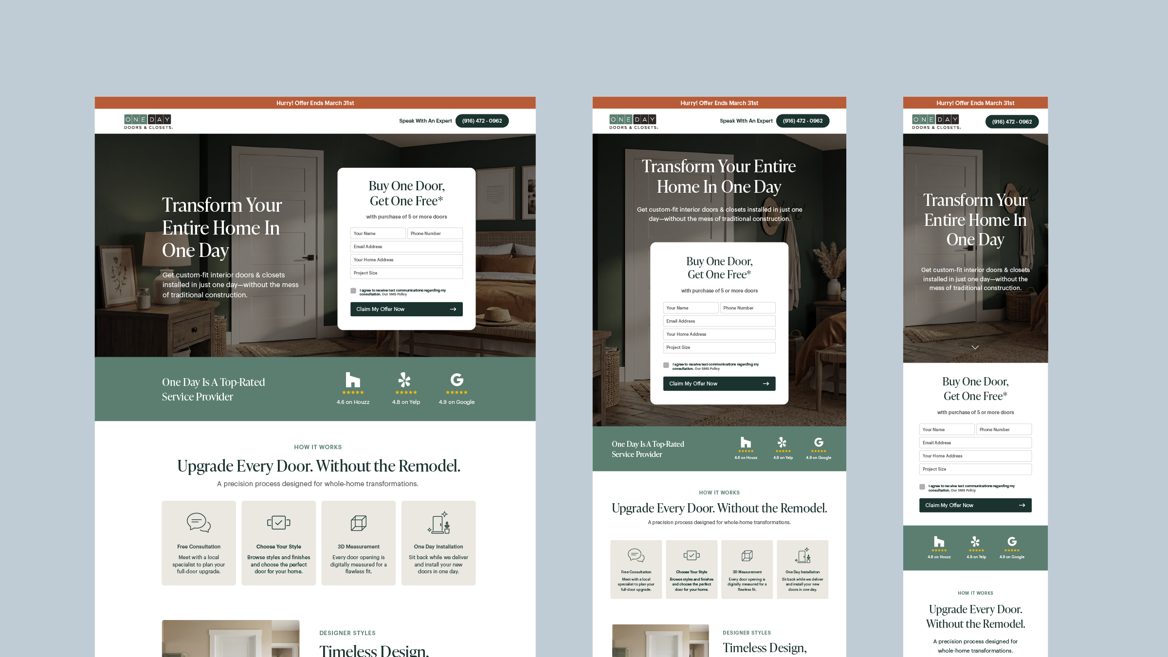
The root issue wasn't purely visual. The page was trying to do too much: multiple calls to action competed for attention, the offer wasn't clearly communicated, and the layout felt heavy and cluttered — especially on mobile, which was our most viewed screen size.
The Constraints
This wasn't a blank slate. Before I could solve anything, I had to understand what couldn't change:
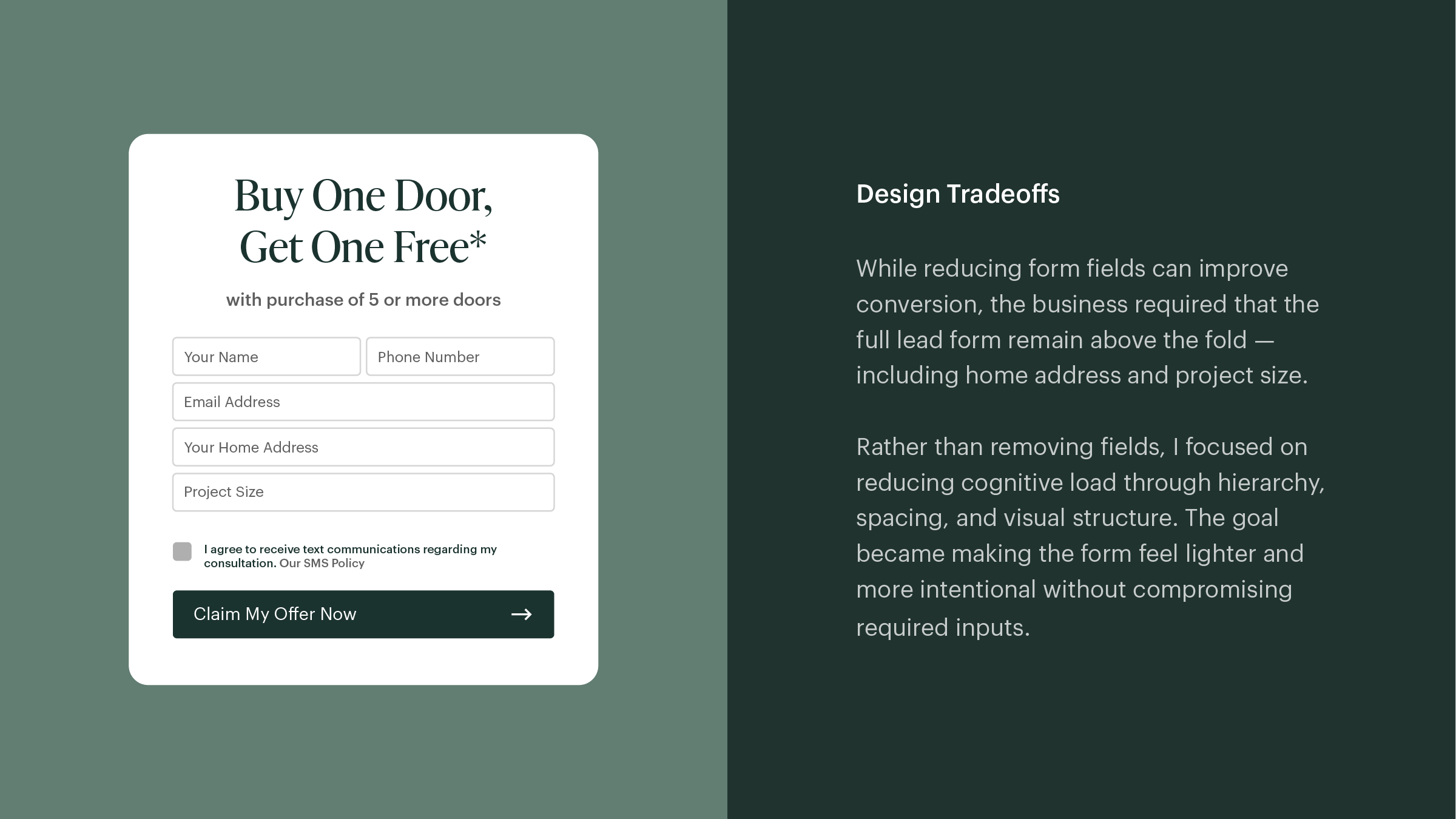
The full lead form was required above the fold
All fields had to be retained, including home address
The urgency bar had to stay
A full infrastructure rebuild was off the table
Working within these constraints wasn't a limitation. It was the actual design problem. The challenge was to make the page dramatically clearer without changing the things the business depended on.
The Approach
Before opening Figma, I ran a brief session with the marketing team to get aligned on audience, goal, and offer clarity. What we were selling wasn't complicated, but the page wasn't saying it cleanly. That diagnosis shaped every decision that followed.
From there, I simplified:
Reduced competing CTAs — three calls to action were splitting user attention. We narrowed it to one clear next step.
Strengthened visual hierarchy — the most important information wasn't reading first. We fixed the order.
Rebuilt the layout responsively — mobile wasn't an afterthought this time; it was the primary canvas.
Designed modular components — instead of a one-off layout, I built reusable blocks the team could reconfigure for future campaigns without starting from scratch.
That last decision turned out to be as valuable as the conversion lift itself.
The Results
+76% conversion lift — from 2.1% to 3.7%
75% faster production — the team now launches new landing pages in a third of the time, using a scalable template built for testing and iteration.
The modular system meant the work didn't stop at one page. Every future campaign benefited from the same foundation — clearer, faster, and easier to test.